Guest post by Ronja Steinbach on COVID-19
This is part of a series of guest posts from students in my Biostats class at UH Mānoa. For their final projects, students analyzed data to understand what factors explain variation in COVID-19 incidence. Read more about the project here.
Getting started
As COVID-19 dominated news headlines, Donald Trump’s reaction to the pandemic was interesting (or perhaps horrifying is a better word) and always frustrating. According to health experts, his words and responses were:
- Simply false, for example claiming that the pandemic was under control and that cases were close to zero at the beginning of the outbreak, even though they were increasing in number and were expected to do so as testing ramped up.
- Late. Every action that Donald Trump took was well behind the actions taken by those countries that have much more successfully combatted this outbreak.
- Confusing. When the travel ban to Europe was announced, Trump stated that flights would be stopped, but failed to clarify those activities and people that were exempt for this order.
The response of governors across the states has varied, but not more than the response of the general public: some people denying that there even was a virus, people going about business as usual, others social distancing, and some people drinking bleach to protect themselves. With no consensus, I was interested in addressing the question “Does party affiliation of a state in the 2016 election have a significant impact on the incidence rate of the virus in that state?”; my hypothesis being that those states with more Trump supporters would have been more likely to listen to his rhetoric and take it to heart and therefore would have been worse about social distancing and taking the virus seriously, resulting in a higher incidence rate of the virus. Furthermore, data continued to come out about minorities and people of lower socio-economic statuses being hit disproportionately, so I decided to tag the questions “Does the proportion of the population that is minority and median household income affect the incident rate of the virus across states?” on to my statistical investigation.
Data Collection
My first step was to collect data.
I went to the Federal Election Commission to obtain the stats on what percent of the vote went to each candidate—Trump or Clinton—and then created a new column simply stating which candidate won that state. (https://www.fec.gov/introduction-campaign-finance/election-and-voting-information/federal-elections-2016/)
I found information on the incident rate (per 100,000 people) of the virus on April 18th, 2020, using the data from the John Hopkins University COVID Tracking project. (https://github.com/CSSEGISandData/COVID-19/blob/master/csse_covid_19_data/csse_covid_19_daily_reports_us/04-18-2020.csv)
I gathered data on the median household income from the U.S. Census Bureau. (https://www.census.gov/library/publications/2019/acs/acsbr18-01.html)
Lastly, I found demographic information on the Henry J. Kaiser Family Foundation, which I then manipulated to create a proportion of the population that is non-white, by state. (https://www.kff.org/other/state-indicator/distribution-by-raceethnicity/?currentTimeframe=0&sortModel=%7B%22colId%22:%22Location%22,%22sort%22:%22asc%22%7D)
Analysis
Now that I had all my data, I needed to analyze it…statistically! Since my main question had a categorical variable (the person elected—Trump or Clinton) and a numerical variable (the incident rate—which is a number that in this could theoretically range from 0 to 100,000), I needed to use a two-sample t-test, which would compare the average incident rate of states that voted for Trump versus the average incident rate of states that voted for Clinton in 2016. My two secondary questions both have 2 numerical variables: incident rate being compared to the 2018 median household income (again a number that could be from 0 to anything) and the proportion minority (another numerical value, that could range from 0 to 1), respectively. Therefore, I would use a linear regression model; this looks at whether the value of one variable can predict the value of the other (response) variable, in this case incidence rate of coronavirus cases per 100,000 people.
Results
So, what did I find by doing these tests?
- There was a significant difference in the average incidence rate of states that voted for Trump versus for Clinton.
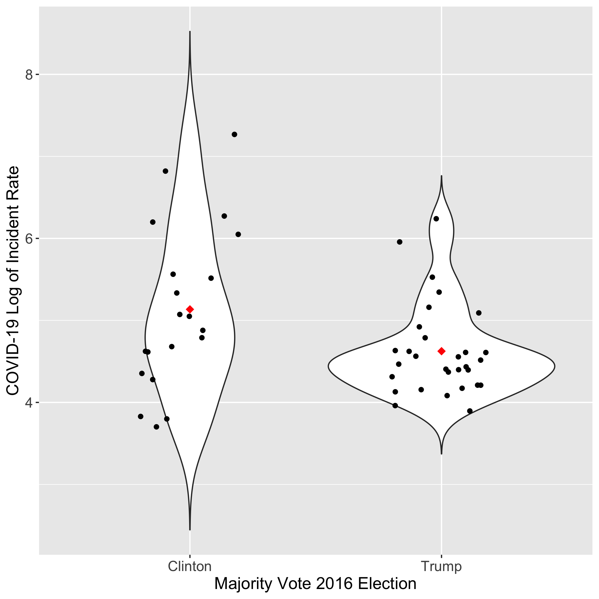
What you see in the graph above, is the distribution of values (log transformed in order to meet the assumptions of the t-test) and you see that the red dot, indicating the average of the data, is higher for Clinton than for Trump. In short, this means that the incident rate was actually, on average, higher in states that voted for Clinton. This result was considered “significant” indicated by a p-value of about 0.024, which is lower than 0.05, which is the generally accepted value for making a result hold weight in the eyes of scientists. This was the opposite of what was expected.
- There was a slight positive association between 2018 median household income and the incidence rate, but it wasn’t significant.
By positive association, indicated by the upward sloping line, I mean to say that as the household income increases, so too generally does the incidence rate (by a correlation coefficient of .27). This was the opposite of what was expected, but with a p-value of .06, it was not deemed significant. The statistical power of the test was limited, seen in a confidence interval of -0.0140 to 0.506.
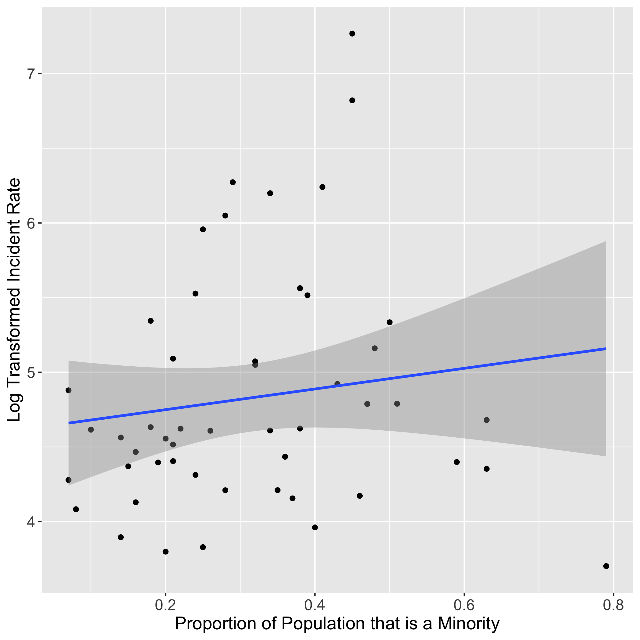
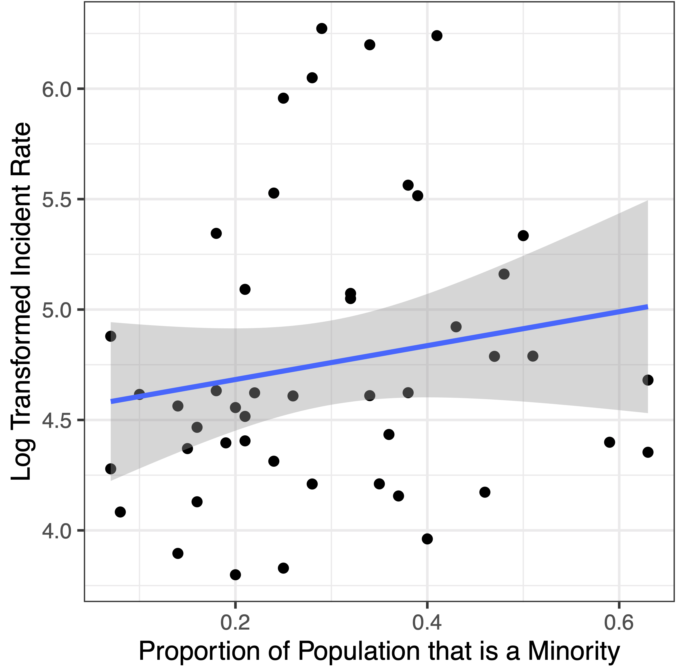
- There was also a basically no association between the proportion minority of a state and the incidence rate and it too was not significant.
For this graph, you once again see an upward sloping line, indicating a positive correlation (in this case a correlation coefficient of 0.14), meaning as proportion of the population that is a minority in each state increases, so too generally does the incidence rate. This was the expected result, but with a p-value of .34, it was not deemed significant. Here the confidence interval was -0.146 to 0.401.
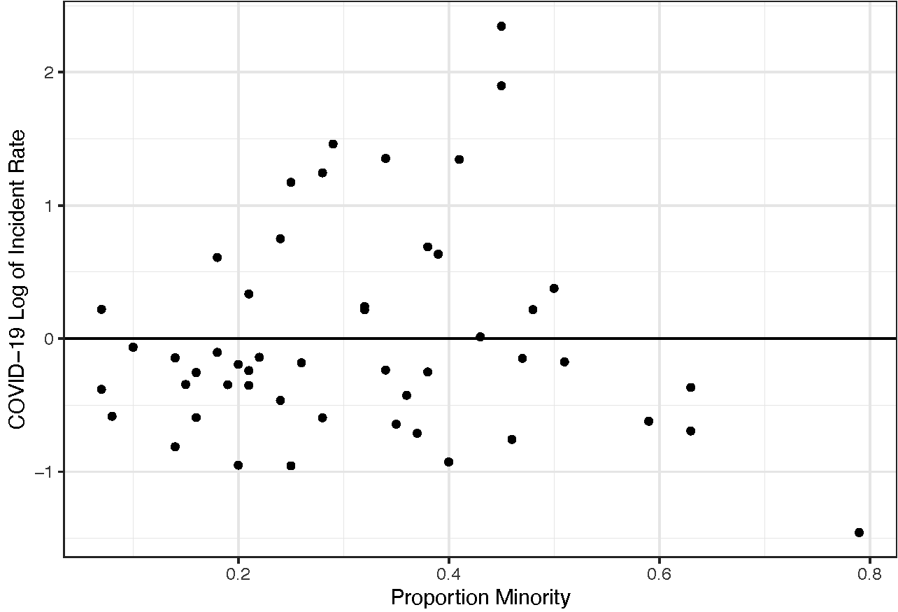
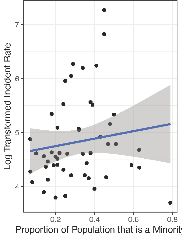
In the graph of the residuals (shown above), there are 3 evident outliers, so I decided to do the test again, omitting them from the data to get:
The results were the same as before, but the p-value went down to 0.25 (versus 0.34) and the correlation coefficient changed to 0.17 (from 0.16). This time the confidence interval was -0.123 to 0.436, indicative of the limitations of this statistical analysis.
Note that the correlation coefficients can range from -1 to 1, where -1 is a very strong negative correlation, 0 is no correlation, and 1 is a very strong positive association; with this in mind, realize that all the correlation coefficients were very small indicate very weak associations between the variables, close to no correlation at all.
Conclusions and caveats
Throughout all of this, it is important to be reminded that there are many factors at play here. To begin, the incidence rate that I was using depended on information from testing and as you probably know, testing for the coronavirus has been extremely biased (to those people generally showing symptoms) and very limited, with a small number of tests being administered, especially at the time of the data I was using (April 18th). This means that it is likely not representative of the whole population. For the second and third questions addressed, related to socio-economic status and other demographic information, bias in testing for the particular populations of interest in this study were likely especially biased, due to an inability to get to a testing site, fear of paying unseen fees etc.
Furthermore, it is important to keep in mind that the United States of America is very diverse in many ways, including geography. Thus, especially when considering the spread of a virus, factors such as population density make a huge difference, and by chance, many of the states will lower population densities voted for Trump.