Guest post by Skylar Hara on COVID-19
This is part of a series of guest posts from students in my Biostats class at UH Mānoa. For their final projects, students analyzed data to understand what factors explain variation in COVID-19 incidence. Read more about the project here.
Since the first case of COVID-19 in Hawaiʻi on March 7, the government has tried to reduce the curve by implementing a statewide order to stay at home which was effective from March 25. I wanted to test whether or not the statewide order actually helped to reduce the curve. Two months after our first case, I was curious to know if Governor Ige’s stay at home order really helped to flatten the curve?
I obtained my data from the covid tracking project which has been collecting statistics from all of the states. I collected data from March 7 till May 1st for the amount of positive cases, negative cases, recovered cases, those who passed away and the total. All of these numbers were cumulative so to test if it flattened the curve, I created a variable for “Active Cases” which takes the positive cases and subtracts those who passed away or recovered from the virus. From there, I calculated how the percentage of active cases changed on a day-to-day basis.
To answer my question, I used Welch’s two-sample t-test to give me a more accurate result because it accounts for the different variance in the two populations. With my explanatory variable being categorical and my response variable being numerical the two-sample t-test was the way to go. After calculating my test statistic, I estimate the mean percent change in both samples as well as the confidence interval for the difference. My parameter estimate was -0.34 and I had a confidence interval of -0.612 to -0.067, meaning that there is a negative difference of daily percent change from before to after the order.
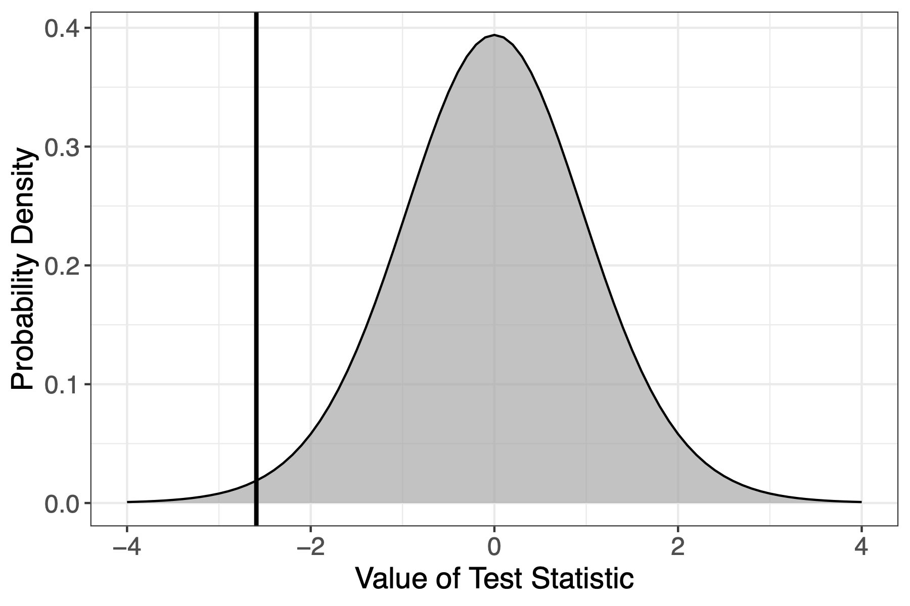
This figure shows the sample distribultion under the null hypothesis with the test statistic I got. This already visually shows that the probibiltiy of receiving that test statistic is quite low.
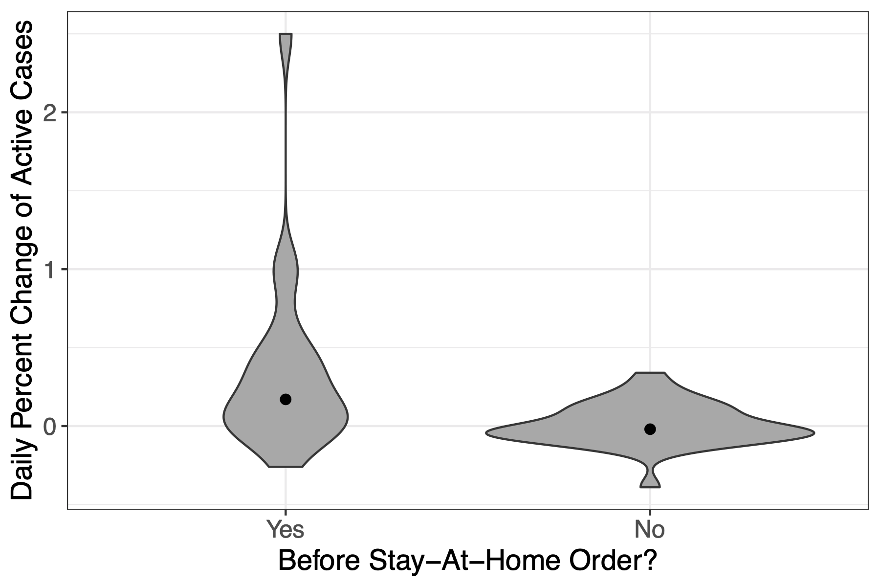
The violin plot shows how the daily percent change of active cases varied before the mandate with some days increasing by over 200%. Whereas for the data after the mandate, it’s more centralized around 0.
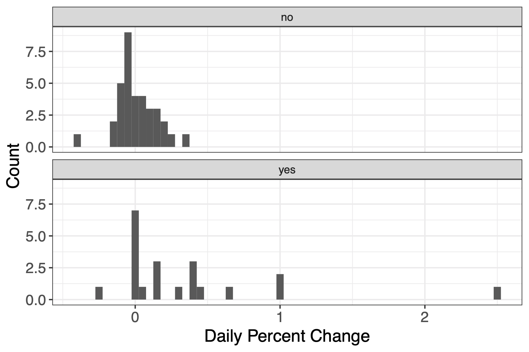
This shows that the same data in another perspective. It allows one to see how the data is spread out for before the order and how condensed the data is after the order.
Based on my analysis, I got a P-value of 0.02, which is below my $\alpha$ of 0.05. Thus, I reject the null hypothesis.
Some limitations with this study is that the data wasn’t consistently available. The number of recovered cases jumped from 0 to 48 which doesn’t give an accurate representation of active cases. There’s also a confounding variable because on April 17 Gov. Ige issued another order to wear face masks in public. This could have affected the number of cases present in Hawaiʻi.